I Like
Good Graphics
How Does
Mirror's Edge Still Look This Good
The Grounded Architecture of Fumito Ueda

I like

GOOD GRAPHICS

I like 'em a lot

I need to tell you something, and it might be controversial. Okay? Because I need to speak the truth. I like good graphics. I like ‘em a lot. PHEW. Feels good to say it out loud. Because I’m in deep with this stuff. I want to know exactly how the game’s draw distance works. I love to pretend I understand what it means when they drop sentences like “rather, just with the more or less 2d-depth buffer generated from that geometry.” It’s just fun, you know? To see how close to realistic games can push themselves. I watch the cutscenes and ads made by Blur, not because I have any real attachment to the story or characters, but just because I like seeing just how shiny and pretty we can make stuff. I like graphics. And if you’re playing video games in the year 2020, it’s a pretty good time to like graphics. I mean, have you seen them?

Death Stranding

The Last of Us Part 2

On a very base level, it’s cool to be living in such a tech arms race, and the developers really highlight this level of technical achievement. Another thing that I love to bask in is the compilations, made by people like SunhiLegend and Much118x on twitter. They perfectly match-cut from game to game, a seamless montage of graphical powerhouses, flowing from one to another like water, a never-ceasing stream of polygons and shaders, a mighty flood of the most expensive and prestigious works the medium has to offer. I’m not being glib when I say I find these montages cool, I really do. But they are incredibly good at revealing how much of a “look” AAA gaming has. The clips just flow into each other so well, the aesthetic changes are so minute.

These games share many other traits as well, one of which is that they’re all flagships. These are the games that get shown off on the biggest stages, that lead press releases and advertising campaigns. There are definitely projects that get big press and lots of attention without showing every pore in their characters’ skin. I mean, Nintendo exists! We're not starving for alternative styles. But if AAA has a “look,” it’s not that.

It's this.

4:03

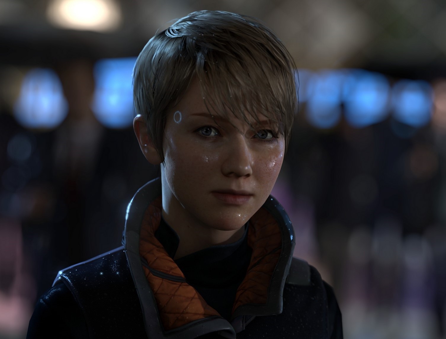
There’s also an inherent level of prestige that looking like this brings. I feel like we’re really susceptible to it actually. For instance the Life and Works of David Cage. I won’t say that all Quantic Dream’s games have absolutely garbage-tier storytelling only considered worth of consideration and prestige because of their graphics. But I will say that about Detroit: Become Human. This game is bad! This game is not good! This game is a 7-year-old’s understanding of a civil rights movement and a 70-year-old’s understanding of interactivity. It’s hard to overstate how much it bungles its central metaphor.

The thing about Detroit: Become Human, though, is that it looks… really good. Like it looks really good. And I genuinely don’t want to condescend towards people who liked it, but… the graphics are the thing that gives it the feeling of “quality,” right? It’s kind of hard for me to imagine that this game would have anywhere near the same level of status, level of support, amount of money behind it, if it didn’t look so much like a AAA, industry-leading game is supposed to look like. I think we just inherently give it the benefit of the doubt. And you gotta admit, games like Detroit look sweet when they’re in a sizzle reel.

5:45

“Seeking to ensure that flagship projects have a symbolic aesthetic of up-to-dateness, officials allow and often demand a modern appearance... however inappropriate it may be.”

That sentence wasn’t written about the games industry. It’s actually from a 2010 paper on international homogeneity in architecture, written by Kathy Pain and Paul Knox. But boy if it ain’t familiar. Their argument in the paper is that increasingly global money markets, controlled by a relatively few set of “world cities,” has led to a “convergence in metropolitan form,” rather than “differences or distinctiveness.” What’s that mean? It means that the distinctive modern look of skyscrapers in New York is aesthetically pretty damn similar to the distinctive modern look of skyscrapers in London, which is, shocker, near and dear to the distinctive modern look of skyscrapers in Hong Kong. And when it’s the same handful of people designing these buildings, instructed to keep the same style as they used for their other landmark projects, things start to get a little… same-y. Yeah, every building individually is gorgeous. But

"The result is that the more cities compete to be different, the more they end up looking the same, each with their sculptural flagship buildings and generic mixed-use regeneration schemes.”

8:15

Hey remember when this essay was about video games? This isn’t about how Nathan Drake’s impeccably modeled ear cartilage is causing gentrification. But I do think it’s a useful model for thinking about how we think about graphics, and what the AAA “style” indicates about the gaming landscape.

For instance, one of Sony’s prestige projects for the PS4 was the Bluepoint remake of Shadow of the Colossus. And when the game initially released on the PS2, it was stylized like a PS2 game had to be. Incredibly sparse details, barren lands. One of my favorite things that resulted from this stylization is how light worked in the original Colossus.

Because devs didn’t have the same liberty with lighting tech we have now, the game kinda faked it, turning the bloom up to blinding levels for a couple seconds to emphasize the vide of a new area. It’s an effect that I find just gorgeous; I think the game would lose something without it.

And then, two generations later, Sony and Bluepoint decided to remake the game. And to honor this artistic juggernaut, to indicate that they were putting the full power of their system and publishing ability behind it, they chose… well, you know. They chose

Realism.

They chose the prestige look. But I think the game has lost some of its visual specificity. It feels, to me, a little less singular now. It fits more neatly into a portfolio.

14:37

I think we are genuinely cutting ourselves off from experiences by this narrow vision of prestige gaming. I actually had a similar experience when I saw Into the Spider-Verse for the first time. I was like, “Animation could look like this?? I’ve seen 4 billion movies with the same CG shininess, and we could’ve had stuff like this?” And it’s not like I wanted a move to specifically do variable frame-rate animation, or any of the other things Spider-Verse does. My mind wasn’t even aware of the possibility space! I had no idea what 90 million dollars would look like when poured into a project taking as big as a swing as this, and that’s one of the reasons I was so blown away by it. It’s why I want to see studio flagships takes these sorts of risks.

There’s no shortage of creativity in the game-space but I want people exposed to the incredible alternative aesthetics that are out there! Use all that processing power, all those shaders and pixels and teraflops to do something other than render pores on a sad man’s skin. Show us all the things we don’t even know are possible because we’ve been so hyperfocused on one definition of “good.” I like graphics. But what I would genuinely love is to hear that a game has good graphics and just not have any idea what that means anymore.

Confuse me.

Blindside me.

Dazzle me.

Show me something new.